Making the affordable choice the obvious one. A homepage redesign for Smile Provide, the UK's at-home clear aligner brand, built to turn visitors into booked consultations.
- Client
- Smile Provide
- Industry
- Clear Aligners
- Scope
- eCommerce, Shopify, UI/UX Design, CRO
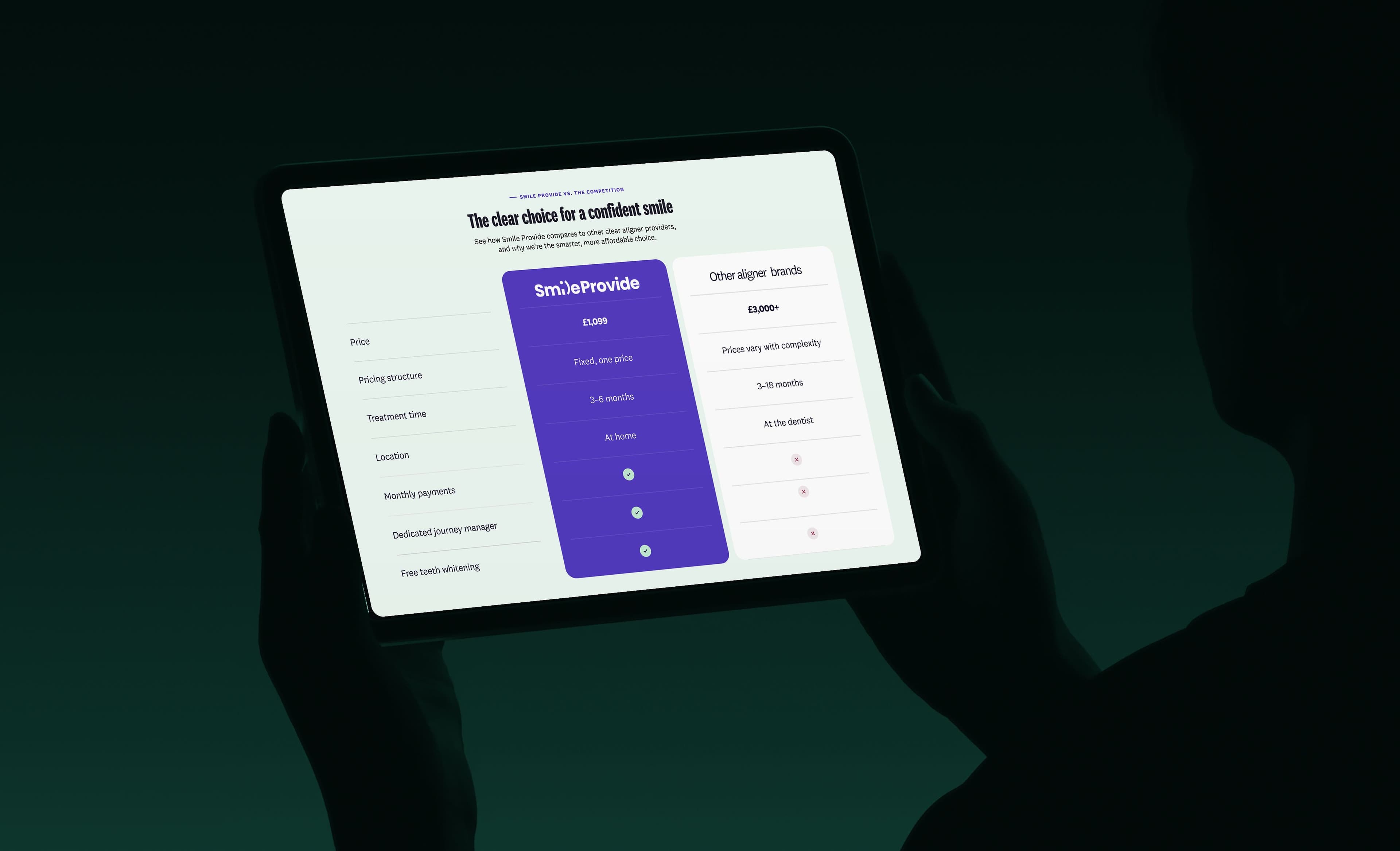
Smile Provide offers aligners from £1,099 at home, against £3,000+ at clinics, but the old homepage buried that under repeated buttons and a hero with no proof. We led with price, payment and treatment time, put the Trustpilot rating and real customer videos up front, and gave the page one clear booking action.
Smile Provide is a UK clear aligner brand offering at-home treatment from £1,099, against £3,000+ for clinic aligners. For people thinking about straightening their teeth, price, monthly payments and treatment time are the first questions, and trust comes straight after, because this is a medical purchase made online.
The homepage's job is to turn visitors into booked consultations. We redesigned it so the strongest parts of the offer are answered in the hero, real customer proof appears early, and every section leads to one clear booking action instead of several competing buttons.
The problem
A strong offer, hidden by the homepage.
Smile Provide offers aligners from £1,099 at home, against £3,000+ at clinics, but the old homepage buried that advantage. Price, monthly payment and treatment time weren't answered up front, the hero had no proof, repeated buttons competed for attention, and the Trustpilot rating and real customer videos were too far down the page to help anyone decide.
- 01Price, payment and treatment time not answered up front
- 02Hero with no proof
- 03Repeated buttons competing for attention
- 04Trustpilot rating and customer videos too far down
The solution
Making the affordable choice the obvious one.
Price, proof and one clear next step at the top.
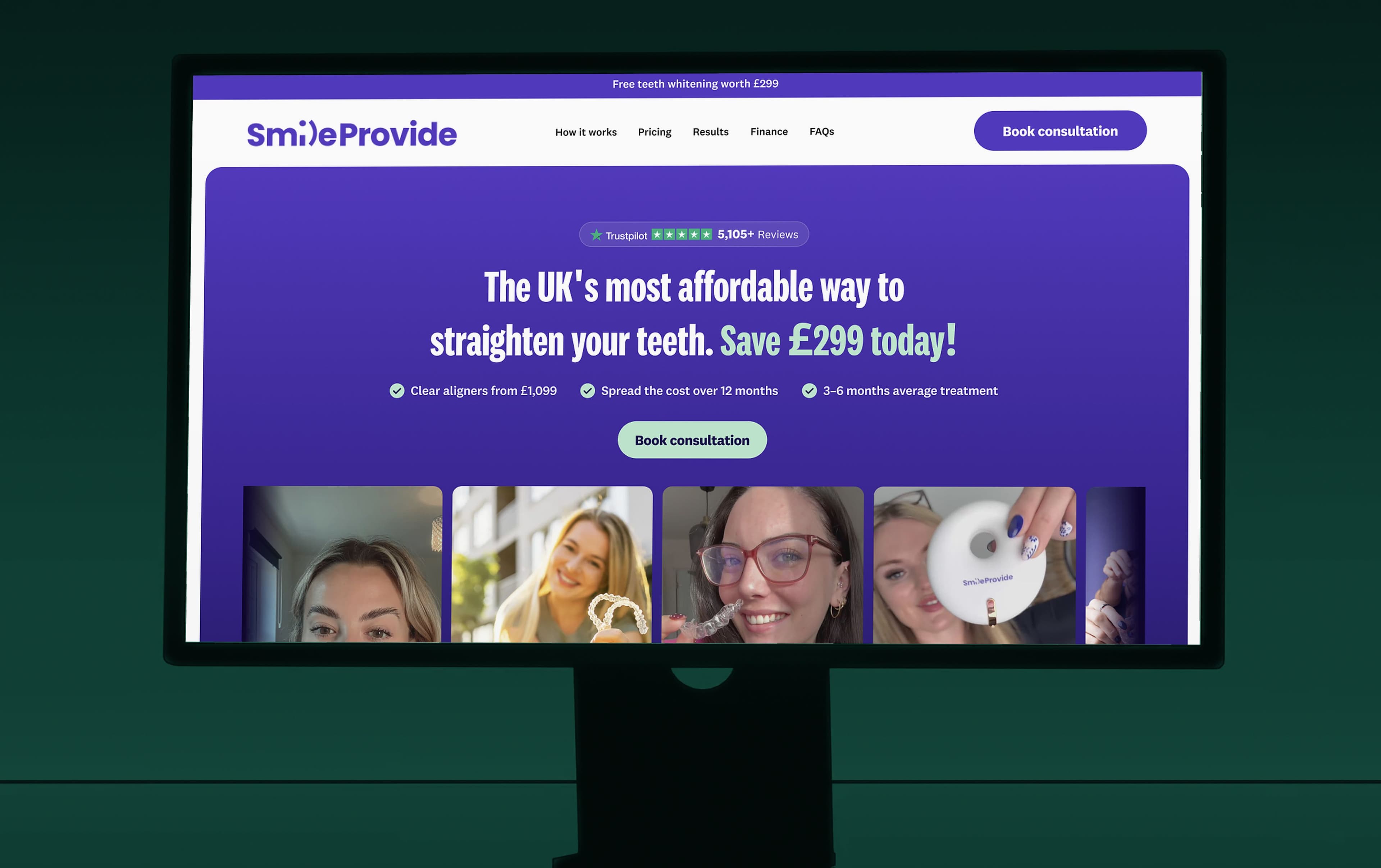
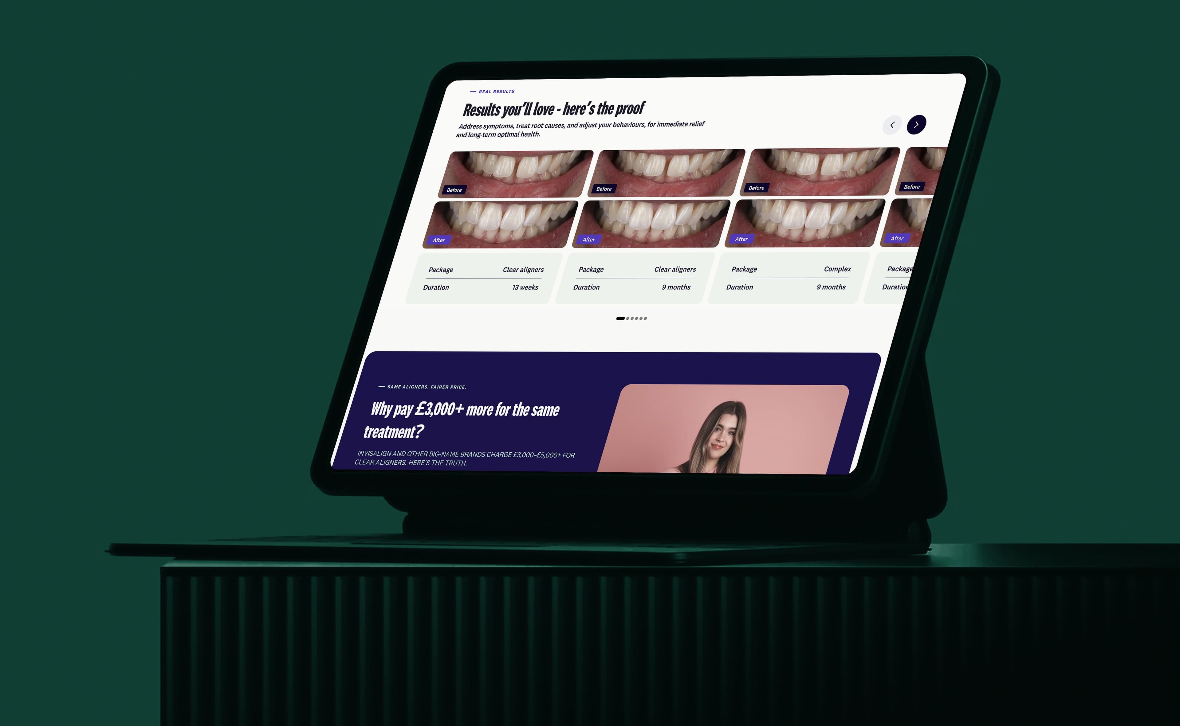
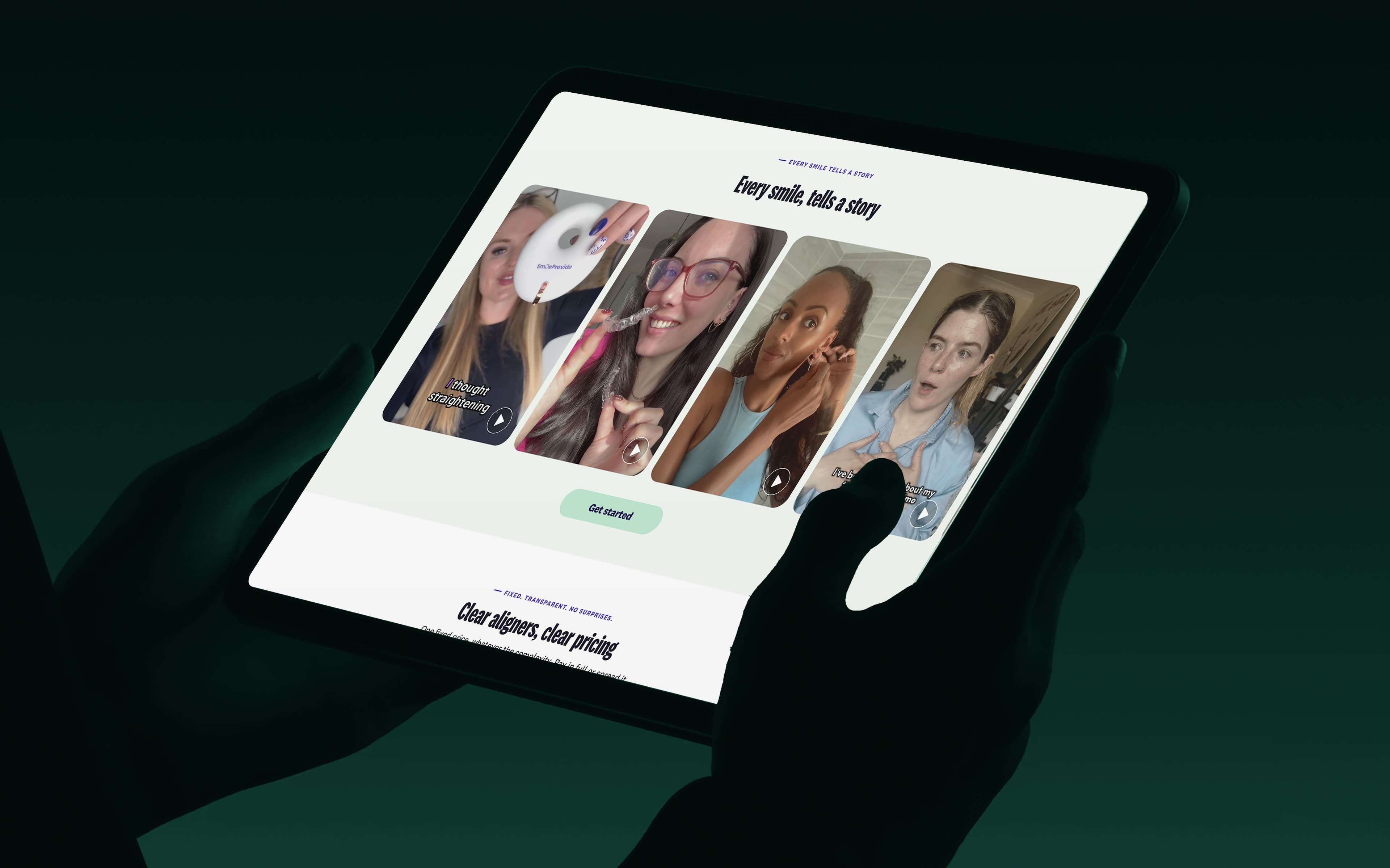
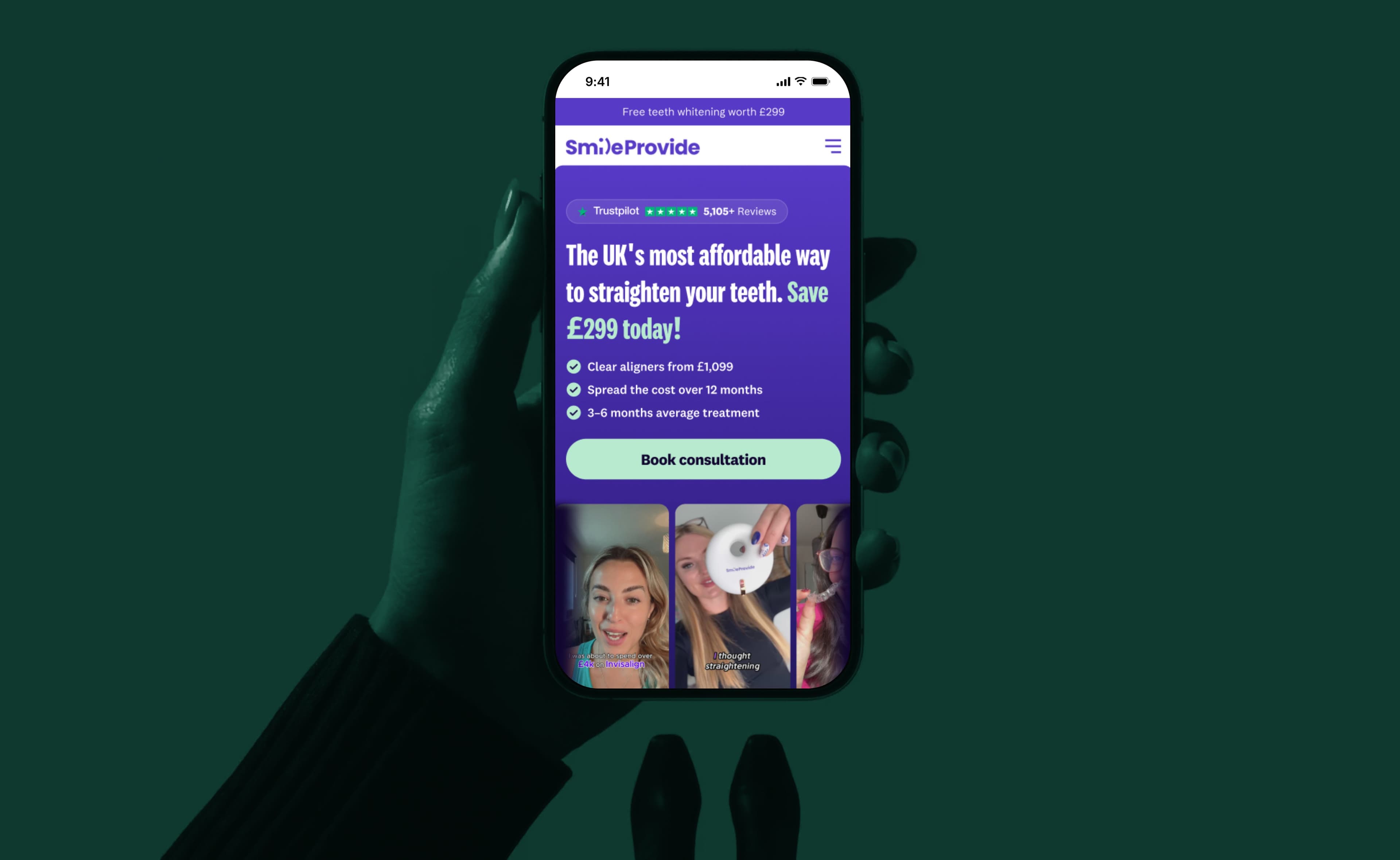
We made the affordable choice the obvious one. The new hero answers the three big questions straight away: how much it costs, what it costs per month and how long treatment takes, with the Trustpilot rating beside them. Real customer videos and a clear comparison with clinic prices follow, and the page now has one primary action, booking a consultation, repeated consistently instead of several buttons pulling in different directions.
Price, payment and treatment time answered in the hero. Trustpilot rating and real customer videos up front. One clear booking action instead of repeated CTAs.
Our approach
Answer the big questions first.
How much, how long, and can I trust you?
We designed the page around the questions people ask before booking: how much, how long, and can I trust you? The hero answers all three, so a visitor who reads only the first screen still understands the offer.
Further down, real customer videos and the clinic price comparison remove doubt, and every section ends at the same booking button. One clear path makes the decision simpler, which is what a consultation-led funnel needs.
Before & after

Review
Words from the client
“Our offer was always strong, but the old homepage hid it. Now price, proof and the next step are right at the top, and booking a consultation feels like the obvious move.”
Thomas
42%
3
Get a free teardown of your website and discover where you're losing revenue.
- Delivered in 48 hours
- Video walkthrough
- No obligation
 A conversation.A clearer next step.
Let’s start with
your business.
Tell us a little about your business and what you’d like to improve. We’ll help you find the right starting point.
Get Your Free CRO AuditA few questions to get started. No obligation.